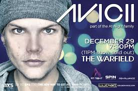
Here, Avicii is shown at the forefront of the poster. He is looking straight at the audience in order to capture their attention. He is pictured wearing normal clothing, which the audience can relate to. However, he still has a cool, edgy look as his facial expression displays this.
The Avicii sign is the most predominant feature of this poster apart from the artist himself. The Avicii symbol is shown at the beginning of the title to show the artists trademark and this is recognisable to the audience. The artist has only included the essential details so that he can promote the concert.
The colours used reflect the music genre the Avicii represents. This is because the lights in the background represent it being dark, linking to the partying lifestyle. This shows what the audience will expect at the concept, which will therefore sell more tickets as they want to go to a cool place like this.
The artists name is at the very forefront of this advertisement, as it is the most important aspect as the audience need to know who is being promoted to them.
The artist has chosen these images in order to promote the concert with a certain feeling. Avicii has given it a cool partying vibe, to attract the audience. This is represented by the bright lights in the background.
The language is very abrupt and to the point, so that not too much information is displayed and the audience can be intrigued by the images. The font is plain so that the audience can read it clearly. There is only one detailed sentence used so that it is not over complicated and the reader can make their own conclusions as to what and where it is all happening.
·
Representation of music artist
·
Connotations of the advert
·
Colours
·
Design/layout
·
Choice of images
·
Typography
·
Style of language
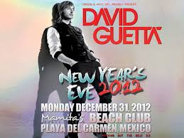
This poster relates to the artists album as the image of David Guetta is the same on the front cover. This allows the audience to link it to the album which they have heard and they will therefore want to go and hear this album live. Therefore it also promotes Guetta's concert. The artist himself is featured on the cover and therefore he is the standout object. The font on the poster is the same as on the album and it is recognisable to the audience due to this.
I will use this research to adopt some of the ideas and themes that Avicii portrays throughout his work. This is becasue we are using the same genre and due to his success, his work is a good model to base our video. We will specifically concentrate on the bright colours that Avicii uses as this relates to the dance genre and will appeal to our target audience.
This post demonstrates a basic understanding of how magazine adverts appeal to an audience and this is because you have not considered the conventions and examples in enough detail. Instead, you have included a very basic overview and have not discussed the codes and conventions of dance in enough detail either.
ReplyDeleteAlso within your summary, you need to focus on your research and inspirations that you have on designing your own magazine advert.