Wednesday 18 December 2013

Digipak Reflection


I decided to use the same theme in my poster for this digipak. Therefore the front cover is the same as one slide in the digipak. We then joined all our ideas from the digipaks together to create a final one which was meant to be our ultimate digipak. In my digipak I focused on creating a digipak that holds its theme throughout and is that each slide relates to one another. Therefore I used the party scene in each slide as it shows our artist colors and makes the audience think of having a good time and partying. This is conventional to the dance genre as artists always try to entertain the audience by using upbeat music and fun scenes. As the image was taken from my music video I displayed low-key lighting which contrasted with bright lights such as pink, green and blue which represent strobe lighting, linking to the party. My front cover consists of this party scene, with the title of our group in bold and both the artists either side of the image. This has worked successfully as the colors are all quite subtle and I have created a good blend between each theme. I used this font for the title page as it stand out due to its size but is also see through so the background is clear. I have used images of me and George which relate to our concept as George is smartly dressed in a suit and I look scruffy in a shirt. This is breaking conventions of a dance music video as usually artists only focus on the performance value to entertain the audience. However, this makes my digipak and video unique from the other artists in this genre. The next slides are of our artist messages, which show thanks to various people. I chose to use separate images of the two characters as they relate to our concept once again. This is because the concept is represented by the two characters and their different behavior and lifestyles and although they are friends, I saw it fitting to separate them to highlight this concept. I used green writing in both slides as this is one of the artists theme colors and it represents the lighting we used for the party scene, making it unique to other artists in the dance genre and therefore challenging these conventions. I decided to use this font as it is easy to read and fun which relates to the music and the genre as dance tries to entertain the audience. For the next slide, of the back cover I decided to just use the party scene with the song list on. I saw this as simple but effective as it clearly states the songs and relates to the rest of the digipak as it shows the party scene. Also the main focus is on the party scene here as it is plain. This will make the audience feel like it is a fun dance video as it relates to the genre. However, i think that I should have used a bolder font for the writing as it is not completely clear against the strobe lighting behind. For the CD slide, I decided to blend in the title to the crowd by making it dark. This creates a cool vibe as relates to the dance genre as darkness is a theme of the party scene. I decided to use a different shot of the party scene here though and I added a pink filter as it is more unique to the other slides. For my final slide I decided to use the same image as the front cover. This is so that when the audience picks up the CD then they will see the a consistent image on either slide which will have more of an impact as it is so poignant. Also these images are of the artists looking serious and this will be seen as cool to my target audience who are also young. 


VOX POPS


My group decided that we would undertake vox pox videos as it is another way of gathering evidence on our target audience and to view their opinions on information for music videos. The good function of these is that we can see the emotions that our audience feel about each topic and question and this can therefore five us a more informed judgement of what they like. This is because doing a vox pox, means that we can see video evidence. When asking the interviewees these questions we can see their emotions, where as a questionnaire doesn't allow us to see these emotions. For example, when asking if they know who Avicii is they could be a response saying that they love Avicii or their initial opinion. By looking in between the gaps and not just the answers we can get a more personal and specific idea of what our audience would like to see in our music video.

The vox pox videos were a great success as we made sure that each video targeted a different category. For example, these categories including asking older and younger people as well as male and females. This allowed us to get more rounded and reliable results as we covered a larger range of the population. Also we wanted to get an idea on how each of these different categories felt about what we want to achieve and their interests in our ideas for a music video. We can now use these results in order to create a formulated and well crafted music video which will try to cover as many of these categories as possible. However, we do realize that everyone has a different taste in music and therefore like different styles. We therefore cannot please everyone and have decided that we will focus fully on our target market in order to make our video a success. Also, we don't want to use too many subcultures that will spoil our aim for the appropriate target market. However, we will try to include others to make this video unique and appeal to other audiences. 

These will also assist us in planning our music video as we can constantly refer to the opinions of our target audience. Not only will we look at the videos which match our appeal, we will also look at those who have different opinions and prefer other genres. This is so that we can come up with some subcultures that will also appeal to these other audiences in our music video.  

Tuesday 17 December 2013

Lyric analysis

The hidden meaning behind these lyrics is to have fun when you are in your youth but get to grips with your life when you are older and growing up. This is by finding yourself and becoming wise. 'Wish that I could stay forever this young' is a line which shows how the artist enjoys his youth due to having no worries or responsibilities. However, he contrasts this by saying how he should be woken up when he is older, in order to settle down and have a structured life. He also says that he 'didn't know' he was 'lost', as he had experienced so much fun and had been deluded by this being the most important thing in life. However, he contradicts himself by saying that he wishes he could stay young forever to show how its the right thing to change although he had a lot of fun.  

Monday 16 December 2013

Rough Cut

Why is a rough cut important to consider?
Why it is important to consider audience feedback?
How did u receive you feedback? You tube, interviews?
What feedback did u receive?
How will the feedback assist you with finalising your final music video?

Rough cut is important to consider for the development of our music video as we gained a lot of feedback and critics from it. This allowed us to make changes when appropriate and to verify the parts that we did well.  It is important to consider audience feedback as it allows us to gain a relationship with our audience so that they have an input into what our music video contains and its ideas. Also, as our audience are expert in our genre, they can give good feedback on what the expect from a dance video and what they like and dislike about our music video. We could then edit it to suit their expectations. We also wanted another perspective on the video as after a long time of editing and making it, our opinions could be effected and probably biased. Therefore gaining opinions from our target audience has allowed us to gain some good knowledge.

We received feedback by the use of social networking site, Youtube which has millions of users and therefore we wouldn't be short of opinions. People simply commented underneath the video in the comments section giving us feedback and their opinion on our music video. We also conducted interviews where people watched the video and then we asked them questions about it. However, we made sure they were quite lose questions as we wanted our audience to speak flowingly about the video in detailed opinions. This would allow us to gain more from the task.

We received a variety of comments ranging from praise for the video to points at which our audience thought we needed to improve. One user commented on the editing, saying that we shouldn't use so many straight cuts. Therefore we added more of a variety of transitions such as a zoom shot and fades. Also our audience identified that there was not enough of a difference between the characters at the end, which relates to the concept of the video. Therefore we lowered the lighting of the poor character to represent how his life is going downhill, compared to his friend who had natural lighting relating to his happy, well-off lifestyle. From the interview, we received feedback from our target audience over a range of topics that our music video covers. One that was particularly focused on was the concept of our video, as this is something that we want to capitalise on by making it unique. However some critics said that the shots were too long so we went back and added shorter shots during the party.

Some of the comments we encountered included:

  • 'I'd like to see more of a variety of transitions'
  • 'I love this concept, very different!'
  • 'Some shots seem to long when the characters are at the party'
  • 'I love the entertainment value in this video'


Wednesday 11 December 2013

Magazine advert reflection

Through my research on other magazine posters I understand that colors, lighting and the representation of the artist is needed in order for the target audience to be attracted to the song and the album. The research allowed me to understand what elements are needed in order to make a good film poster for a dance music video. My ideas and inspirations behind my poster are to focus the colors that we used during the music video, and to follow the concept of one of the boys going to a house with nothing which is placed on the left of the poster and the boy who has a job and family, on the right of the poster. This poster will help me when using photoshop as it will give a idea and the base of my poster when i start using photoshop. I made a paper based version of the poster so that I could get an idea of the layout and details that i wanted to include in the final version.

For my magazine advert, I used inspiration from my artist Avicii who's song we are using 'Wake Me Up'.
The advert that I used was promoting his concert to his target audience using the dance genre. The Avicii sign is the most predominant feature of this poster apart from the artist himself. I therefore tried to adopt this concept by making the two artists the forefront and main theme of the advert. The Avicii symbol is shown at the beginning of the title to show the artists trademark and this is recognisable to the audience. The artist has only included the essential details so that he can promote the concert. The colours used reflect the music genre the Avicii represents. I tried to use this technique as we went with florescent pink and green as our main color theme. I did this in my paper poster by creating a division between the characters in these colors. This looks like a flashing bolt, which is related to the clubbing scene as strobe lighting effects are a strong feature. This is because the lights in the background represent it being dark, linking to the partying lifestyle. I also carried this theme on by splitting half and half of the title in the selected colors. This shows what the audience will expect due to the concept, which will therefore sell more tickets as they want to go to a cool place like this. Avicii's name is at the very forefront of this advertisement, as it is the most important aspect as the audience need to know who is being promoted to them. I also used this technique by putting it horizontally across the page in a big font so it is recognizable. However, I used a different font that makes it unique looking. Avicii has chosen these images in order to promote the concert with a certain feeling. Avicii has given it a cool partying vibe, to attract the audience. This is represented by the bright lights in the background. I therefore tried to replicate this is my draft advert by giving a fun vibe which the audience can enjoy and have the desire to watch this group. 

As you can see in my paper design, I have followed the inspirations I gained through my research as I have drawn the artists at the forefront of the advert and the title of the artists in order to make them stand out. This is so that the audience can build a connection with the artist and see what they look like as they are a new group. I also included the colors that represent our group and that we agreed on, Florescent green and pink. This give the poster a party feel and relates to strobe lighting of a disco or club. I also decided to put the bolt between the characters as this relates to our concept, showing that one is happy and has a good job and family and the other is unhappy with no job or family although they are friends. Also the costumes represent this concept as George has a nice suit on and a sharp haircut whereas the other character (myself) has a dirty shit, scruffy hair and looks unhappy. 


After making this paper-based advert I decided to create the real one on Photoshop as it has a lot of features and tools which will assist me with editing and creating a professional looking advert. This was my product after making some changes to benefit the outcome. 

As you can see I have made some changes between the paper draft and the final version to make it look more professional. Firstly, I decided to edit in a crowd from the party scene as a crowd developed the conventions of dance and connoted people having fun. Also the advert looked quite plain and basic beforehand and this gave it more detail and a better view. Also adding in the crowd will allow the audience to notice straight away that this is a dance genre music video and they will therefore relate to it more. Also because the characters are positioned in front of the party scene, it shows that they are more dominant and have power over the other people there. This will make the audience look up to them as this is quite a cool affect. Next, I decided that rather than using the strobe bolt down the center of the page, that I would use lasers in the background instead. I did this as I think that it is easier to relate to a club rather than just the bolt. Also it is a more subtle affect and the strobe lighting doesn't take the attention away from the main characters. Also it look more crazy as the lighting is going everywhere which creates an intriguing affect. I used pink and green for them again as these colors represent our group and they are loud, fun colors.  I chose to use the same images of Me and George from the first picture although these show us looking more serious. This was done purposely as it portrays a deeper feeling on the audience as it shows that the artists are serious about the work. Also this serious look is seen as cool and the audience will aspire to be like their idols. which I used to connote the emotion that went into writing their album. Also their facial expressions would really draw an audience in as they are looking directly at the audience and the audience will like this as they will feel more connected to the artist as they are not hiding away. Next, I decided to change the font of the title as it looks more appealing to dance genre lovers as it relates to the dance/party scene. It also looks more professional as the writing is more subtle and not so loud. 


Thursday 5 December 2013

Magazine Advertising


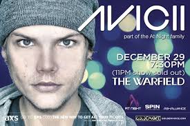
Here, Avicii is shown at the forefront of the poster. He is looking straight at the audience in order to capture their attention. He is pictured wearing normal clothing, which the audience can relate to. However, he still has a cool, edgy look as his facial expression displays this. 

The Avicii sign is the most predominant feature of this poster apart from the artist himself. The Avicii symbol is shown at the beginning of the title to show the artists trademark and this is recognisable to the audience. The artist has only included the essential details so that he can promote the concert. 

The colours used reflect the music genre the Avicii represents. This is because the lights in the background represent it being dark, linking to the partying lifestyle. This shows what the audience will expect at the concept, which will therefore sell more tickets as they want to go to a cool place like this. 
The artists name is at the very forefront of this advertisement, as it is the most important aspect as the audience need to know who is being promoted to them. 

The artist has chosen these images in order to promote the concert with a certain feeling. Avicii has given it a cool partying vibe, to attract the audience. This is represented by the bright lights in the background. 

The language is very abrupt and to the point, so that not too much information is displayed and the audience can be intrigued by the images. The font is plain so that the audience can read it clearly. There is only one detailed sentence used so that it is not over complicated and the reader can make their own conclusions as to what and where it is all happening.


·               Representation of music artist
·               Connotations of the advert
·               Colours
·               Design/layout
·               Choice of images
·               Typography

·               Style of language
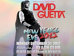
This poster relates to the artists album as the image of David Guetta is the same on the front cover. This allows the audience to link it to the album which they have heard and they will therefore want to go and hear this album live. Therefore it also promotes Guetta's concert. 

The artist himself is featured on the cover and therefore he is the standout object. The font on the poster is the same as on the album and it is recognisable to the audience due to this.        

I will use this research to adopt some of the ideas and themes that Avicii portrays throughout his work. This is becasue we are using the same genre and due to his success, his work is a good model to base our video. We will specifically concentrate on the bright colours that Avicii uses as this relates to the dance genre and will appeal to our target audience.                                 


History of music videos

People can consume a music video by;
- The album and single
- TV music channels
- The Internet
- The radio
- Concerts
- Record players
- Cassette tapes
- A magic Lantern
- Itunes - downloading music videos
- Apps

This has changed over the years as today music videos have become a lot more available for the audience through the use of technology. Now the audience can use websites such as Youtube to view music videos for free. This is also a very fast process as a click of the mouse allows the user to view the video. Years ago however, when there was no access to the Internet, people would buy record players to listen to the music and occasionally see a music performance based video on the Television. The initial invention of the music video began with the use of a magic lantern, which a man named George Thomas who projected a series of still images on a screen simultaneous to live performances. People were then able to watch music videos through the first 24 hours music TV in 1981 called MTV, which has evolved into a huge music video company which are now viewed today over 5 channels belonging to them. In 2005 the internet was the next technology to host be a hub for music videos. It is still a huge factor in them today and are peoples most common way of viewing music videos. The website that has the most music video views is Youtube. The most expensive music video of all time was Michael Jackson's 'Scream' which cost $7million to produce. Special effects are also used in todays music videos. Fillers, lighting, hd cameras and green screen are all common features used to make the music videos of today.